Monday, August 27, 2018

Creating Media: Idea Generation

Creating your Magazine: Idea Generation

Task: Create a mind-map of ideas in which you come up with ideas for the following:

Masthead: What is the name of your entertainment music magazine?

  • Beetz
  • Pop star 
  • Symphony
Coverlines: What articles are you going to entice readers with on your front cover?
  • Interview with person on front cover: journey to fame
  • Artist trends that you should follow
  • Music Festivals to attend this summer
  • Competition to win guitars and concert tickets
  • Ed Sheeran reveals what really happened behind closed doors with his tour manager
Image: Come up with ideas for the main image on your front cover
  • Person who interview is about in the page spread, holding a musical instrument (eg: guitar, ukulele) wearing a fashionable outfit at the time the photo was took with a serious look on their face.
Price: How much do you think is an appropriate price to pay to maximise profit but also ensure teenagers can afford your magazine?
  • £2.00
Representation: What ideas or ideologies do you wish to promote? feminism? positive representation of teenagers? No stereotypes etc. 
  • Music is a way to express yourself 
  • It's never too late to learn to play an instrument (competition) 
  • Positive representation of teenagers (how the main image went from being a normal school girl to a world star through her love of music- inspiration to others to follow their dreams). 
Any other ideas you wish to include?
  • Use of the colours red, black, white and blue. 
  • Put bar-code and issue number in the bottom right hand corner (not important but has to be on the front cover to look real)


Creating Media: Market Research

Creating Media: Market Research

Questions to ask:
  • What is your age?
  • What is your gender?
  • What colour combination do you like the best?
  • What catches your eye the most on a magazine's front cover?
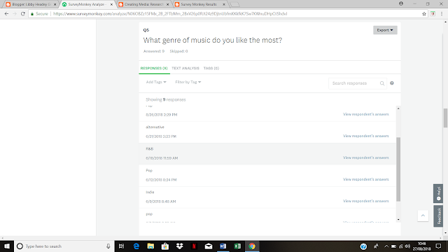
  • What genre of music do you like the most?
  • How much would you pay for a magazine?
  • Who is your favourite artist?
  • What interests you the most inside a magazine?
  • Do you prefer online or paper editions of magazines?
  • How often do you read magazines on average?

Survey Monkey Results...


Majority Answer...
1) 12-15/25+
2)Female
3)Red and Black/Black and White
4)Image
5)Pop
6)£2-3
7)Ed Sheeran
8)Interviews
9)Paper Copy
10)Less than once a month


Creating Media: NEA Brief

Creating Media: NEA Brief 


Sunday, August 26, 2018

Creating Media: Maslow and audience needs

Creating Media: Maslow and audience needs

Maslow's Needs
Need to survive: used by advertisements for food, drink, housing, etc
Need to feel safe: advertisements for insurance, loans and banks promise security and freedom from threats
Need for affiliation or friendship: advertisements that focus on lifestyle choices like diet and fashion use people's desire to be popular. They may also threaten them with the failure to be liked or fit in.
Need to nurture or care for something: advertising which shows cute animals and small children brings this out in the viewer.
Need to achieve: advertisements that are linked with winning, often promoted by sports personalities, tap into the need to succeed at difficult tasks.
Need for attention: advertisements for beauty products often play on the need to be noticed and admired.
Need for prominence: advertisements for expensive furniture and jewellery may use people's needs to be respected and to have high social status.
Need to be dominant: advertisements for products like fast cars offer the possibility of being in control through the product.
Need to find meaning in life: advertisements for travel or music may appeal to people's need for fulfilment.

Lifestyle Categories 
Cowboys: People who want to make money quickly and easily
Cynics: People who always have something to complain about.
Drifters: People who aren't at all sure what they want.
Drop-outs: People who do not want to get committed in any way.
Egotists: People who are mainly concerned to get the most pleasure for themselves out of life.
Groupies: People who want to be accepted by those around them.
Innovators: People who want to make their mark on the world.
Puritans: People who want to feel they have done their duty.
Rebels: People who want the world to fit in with their idea of how it should be
Traditionalists: People who want everything to remain the same.
Trendies: People who are desperate to have the admiration of their peer group.
Utopians: People who want to make the world a better place.

Task: How could Maslow's theory apply to how magazines are being sold directly to target audiences? How could lifestyle categories be useful for magazine publishers?
Look at the following two texts and write a paragraph explaining how each one is designed to appeal to their target audience, using some of the terms above in your analysis paragraph.


1) Maslow's theory applies to how magazines are being sold directly to target audiences by the producer of the magazine thinking about the reader's interests and needs, which are found in his theory, and then applying this to the magazine in order for the barrier to be broken down between the consumer and producer. The theory also fits in with the idea of how target audiences are made. This is because by looking at the different ideas of what a person needs, they can be placed in order from what is most to least important to a them which is different for everyone For the producer, it is important to look at what their target audience finds most important and then applying this to their magazine in order for their magazine to be directed at the right people who all share the same interests which makes up the target audience. However, so that the magazine an appeal to a wider audience, the producer must try and include as many needs as possible.

2)Lifestyle categories can be useful for magazine publishers because they would have a better idea of who their specific target audience is and what appeals to them most. They can then use this information and apply it to the magazine in order to make their magazine more popular by advertising what the target audience is most interested in. Then, since the target audiences is made up of a big group of people, by looking at the lifestyle categories, the magazine publishers would know what the target audience would want to see in their magazine in order to keep them hooked.
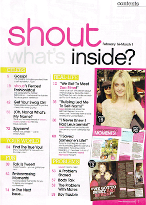

3)Shout has been designed in order to appeal to its target audience of young girls by firstly including as many of Maslow's needs as possible. For example, they use the idea of the need for affiliation or friendship in the section called "Celebs" where the magazine advertises "Shout's Fiercest Fashionistas". This relates back to the need of wanting to be liked and to be popular as the magazine is trying to sell the idea of if you follow what celebrities are wearing and be like them then you will be liked and become a better version of yourself. This draws readers in as the target audience would be interested in fashion and beauty and "improving" themselves through this, In addition, Shout also shows the need for attention in the section "Problems" where the magazine advertises giving tips for "body talk". This plays on the idea of needing to be noticed and admired which once again relates to the target audience of young girls and how they want they want to apply make-up and wear the latest trends to look good and be noticed by their peers. Consequently both these needs link to why the magazine appeals to its target audience because of the young girls wanting to look good and get the popularity and friendships out of it. Shout also uses a two different lifestyle categories that are Groupies and Egotists. By using both of these lifestyle categories, the magazine appeals to a wider audience as the magazine focuses on Egotists by making sure that the target audience gets enjoyment for themselves out of reading the magazine and tips on how to improve their life. Shout also focuses on Groupies by almost telling the reader what they have to do in order to be accepted like what to wear and how to present themselves.
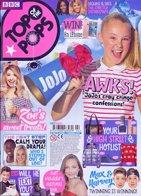

Top of the Pops has been designed in a similar way to Shout in order appeal to its target audience of younger girls (compared to Shout) however there are many notable differences which makes this magazine unique. For example, the idea of Maslow's needs have been used in a different form in order to appeal to this different target audience. This includes using
the need to find meaning in life (from a child's point of view) since there are various advertisements for children's pop music and artists on the front cover of the magazine such as Max and Harvey's faces (singers). Top of the Pops has also used (similar to Shout) elements of the need for affiliation and friendship since it advertises "Your High Street Hotlist" which tells the reader what they should be buying in order to 'fit in' or 'fit the stereotype'. This advertisement also links to the need for attention since it is also telling you what beauty products to purchase in order to become noticed and admired by everyone else. It is also important to note that the producer of the magazine has designed the front cover so that it's colourful and eye-catching which is appealing to children, who are the target audience. Top of the Pops has also used a few lifestyle categories in order to connect with it's target audience. These include Groupies since the magazine tells you what you should be buying, watching and liking in order to fit in and be accepted by their peers (similar to Shout but for a younger audience). Also, the group of Trendies as the readers would want to be admired by their peers for having things in common such as the things they watch, wear and like.




Saturday, August 25, 2018

Creating Media: Audience and Demographics

Creating Media:Audience and Demographics

Task: To use Channel 4's Tribes to disseminate the 'teenage' audience into their various tribes (ideologies). 

1)Watch the clip on the website and read through the different descriptions of 'groups' of young people.  
Alternative                                 
  • Young alts                                             
  • Skaters
  • Hardcore
  • Hardcore gamers
  • Superfans
Mainstream
  • Chavers
  • Fan girls
  • Chavs 
  • Sports Junkies
  • Blingers
Leading edge
  • Activists 
  • Creatives
  • Urban Artists
  • DIYers
  • Scenesters 
Urban
  • Get Paid Crew 
  • Stylers
  • Trackies
  • Wasteman 
Apirant
  • Trendies
  • Vloggers
  • Hypebeasts
  • New Casuals
2)Consider who you might identify with, based on your own interests. Create a moodboard of images that illustrate your own tribe (ideology), linked to the music, sport, fashion and technology that appeals to people like you. 

I believe through my own interests that I don't actually fit into one specific group and that certain aspects of what I enjoy fit into a range of different groups. However, if I were to pick a group that I can most identify myself as being would be Aspirant because I enjoy shopping for the latest trends and I also prefer to wear something casual such as jeans instead of dresses (mainstream). 


3)Match the magazine title with a group and explain why you think this tribe may consume this product.


Magazine Title
UK Tribe
Explanation of appeal
Key terms: Aspiration, Ideology, Target Audience
Thrill
Alternative
Thrill would appeal to the UK tribe of Alternative because its target audience is skaters which fits into the ideology of the Alternative tribe. This is because the target audience would aspire to become a better skater as they are interested in learning new skills and improving their ability and knowledge.
Match!
Mainstream
Match! would appeal to the UK tribe of Mainstream because its target audience is “football fanatics” which fits into the ideology of the Mainstream tribe. This is because the target audience would aspire to improving their knowledge on players, match statistics and teams etc. The UK tribe of Mainstream features the group “Sports Junkies” which relates to the magazine’s subject of football.
Cosmopolitan
Apirant
Cosmopolitan would appeal to the UK tribe of Apirant because its target audience is young women who love beauty and fashion. This links to the idea of the group Trendies in Apirant which means sticking to the latest trends in fashion and beauty which Cosmopolitan’s subject is. This fits into the ideology of Apirant since the target audience would aspire to learn fashion tips and tricks and how to improve their makeup looks etc.
Playstation
Alternative
Playstation would appeal to the UK tribe of Alternative because the magazine’s target audience is “hardcore gamers” which is a group that belongs in the tribe Alternative. This is because the target audience would aspire to read about different games coming out which they can buy and what is popular at the time.


Friday, August 24, 2018

Creating Media: Who reads magazines?

Creating Media: Who reads magazines?

Task:The X-Box magazine is a specialist computer games magazine aimed at 16-35 year old males. Look at the conventions on the front cover and how they might appeal to the target audience. Can you explain how the cover has been designed to appeal to its target audience, using media terminology?


  • Aimed at 16-35 year old males (target audience)
  • The use of the colour yellow fading out into a brown at the top is eye catching for the reader and makes them want to pick up the magazine. The colour yellow reflects energy, danger and mystery which intrigues the reader as the magazine looks as if it is inviting them into a different world of action and adventure. It should also be noted that this is the magazine's aim in order to get the reader to buy the video games and take them away from their lives and into the game they are playing. 
  • The masthead, reading "X-BOX", is bold, clearly displayed and stands out because of the colour contrast of brown, yellow and white. Directly underneath the masthead is the strapline "The Official Magazine" which suggests to the reader that the magazine is widely-known and is the only one of its kind, making the readers want to have the magazine even more.
  • The main cover line ("Far cry 5")is advertising a new game which is the focal point of the magazine's front cover because it is its selling point. This is because the target audience would be more interested in buying new games instead of old ones and the magazine is trying to simply get the reader to buy the game by advertising it in a fun, interesting way. 
  • The magazine also makes references to other games through its cover lines, making you want to buy these as well by making them stand out in different fonts, colours and sizes. Clips from other video games are present at the bottom of the page in order to engage the target audience as they may recognise the graphics from the games they already own.
  • The man's hand position suggests the phrase "What are you waiting for?" since his arms are open and ready for something to happen. He also has his head down looking upwards towards the reader which indicates a masculine dominating and a direct mode of address. This makes the reader think that they are already in the game by just looking at the front cover of the magazine since the man is looking at them. Certain objects are placed on the table that he is standing over such as a book which represents knowledge. 
Task: Look at the two front covers of these magazines and consider the following:
  • Typograhpy (choice of font style, colour, placement)
  • Use of images
  • How the page is laid out to attract the eye
  • The use of language- look out for special words that the reader will understand, use of informal address 'you'
  • Promises connected to ideology, values and/or pleasure
Make notes and use each bullet point as a sub-heading. 


Typography 
Elle has chosen to use their signature font of Didot (Serif in nature) which compliments the polish of the front cover and stands out because of it being white in colour which contrasts against the background. The colour white suggests purity and truth. The masthead is in a different colour to everything else meaning that it is eye-catching to the reader. The colours pink and purple suggest femininity and romance which refers back to Elle's target audience of females since the French word for she is 'elle'. The placement of the masthead is behind the model meaning which indicates that the magazine's name is so iconic that it's readers know what the name of it is without seeing all the letters clearly. The cover lines are scattered across the page in different sized fonts depending on the importance of it. This makes the front cover eye-catching and different from other magazines since for example, the word "Refresh!" goes up in sized font as if it is being shouted making the front cover almost jump out at the reader. 
Use of images
Elle has used only one main image in its front cover of a female model wearing a short sleeved jumper over a stripy navy and pink top. She is also resting her arms on a basketball which appears quite quirky and different since the bright orange of the basketball jumps out because it is vibrant and contrasts all of the colours used in the front cover. The model also obscures the masthead which further emphasizes her as an image and how important she is compared to the convention of the masthead since she is in front of it. Since the model is also female this suggests once again the femininity of the magazine and the fact that she is looking at the reader implies a sense of  a direct mode of address which makes the reader feel more included and involved with the magazine. 

How the page is laid out to attract the eye
The front cover is laid out in order to attract the eye by firstly having one image meaning that there is only one main focus. Elle has kept its front cover simple and easy to look at because the whole background is just the one single image. Moreover, all of the cover lines are in the same type of font called Serif, which Elle uses consistently in each issue, and are all in the colour white scattered around the edges of the image. The barcode has been placed at the bottom left hand corner because it isn't important to making the magazine look attractive and different since every magazine has a barcode which doesn't show any individuality. Finally the word "Refresh!" goes from end to end and goes up in font size which attracts the reader's eye because it looks interesting and different as if it is being shouted. 

The use of language
The front cover has used examples of informal address such as the cover line "Wake up your lazy skin" which makes the reader feel more involved as they think that if they read the magazine they will learn more about looking after their skin. This relates to the idea of looking better if you read the magazine which is what Elle is trying to sell (beauty). The cover lines also feature different styles of clothing which would be inside the issue. This would interest the reader into buying the magazine as they want to see the images of the styles the cover lines suggest. Thus all relates back the target audience of young females as they stereotypically are interested in beauty and fashion. 

Promises connected to ideology, values and/or pleasure 
Since Elle describes its target audience as "spirited, stylish and intelligent; she expects to be successful at everything she does. She takes the lead and breaks the rules" shows that they want their readers to be confident role models. Elle tries to sell this idea by giving fashion advice and trends and beauty tips in order to interest its readers into become their 'improved' selves. For example, by trying to get it's readers to take on tips such as how to look after your skin in the morning makes them believe that they will look 'better' if they read and try the advice for themselves. This gives the readers pleasure as they think that they are getting something out of reading the magazine for themselves personally through their looks and knowledge on beauty. 


Typography
Sight and Sound has chosen to use the colours yellow and red for the masthead because they are eye-catching and stand out from the dark background. The colour red symbolises strength, power and danger and the colour yellow symbolises success and confidence which are all traits that are associated with films which is what the magazine is about. The main cover line and strapline are both white which contrasts with the dark background, makes it easy to read and catches the reader's eye. The font is thick for the main cover line because of its importance since the magazine is trying to sell the film to the target audience.The colour white depicts purity and perfection which refers back to the strapline reading "The International Film Magazine" as it suggests that this film magazine is the best in the world. The rest of the cover lines are placed at the bottom of the page in a smaller sized font. This is because they are still important to be featured on the front page as they tell you what is inside the magazine however the main feature of this magazine issue is publicising and advertising the new film "Isle of Dogs".

Use of Images
Similar to Elle's front cover, Sight and Sound have used only one main image in its front cover of Wes Anderson (who created Isle of Dogs) and all the figured he used in order to make the animation. This engages the reader because usually when watching animations, they never see the maker/s of the film so the fact that they can see them on the front cover may intrigue them to read on about the making of the film and what its about. Once again, this image would fit the target audience of 'film geeks' because not only by reading the magazine will they know about the film but also how it was made. The image also stands out because it has been put in front of a dark background which makes the image almost jump out at the reader as the colour black is so dull whereas some of the characters are wearing quite vibrant colours. This could also suggest the mood of the film as being depressing and dismal and then for example, something happens to create happiness.

How the page is laid out to attract the eye
The front cover is laid out in order to attract the eye by firstly, like Elle, having one image meaning that there is only one main focus. Sight and Sound has also kept its front cover simple and easy to look at because the whole front cover is made up of just the one single image with a dark background. Also, the front cover features multiple different colours such as red, yellow, white, pink and blue which all contrast with the dark background. This makes the masthead, cover lines and image jump out at the reader as they are all so colourful and vibrant. The masthead is placed at the top of the page in a big sized font because it is the name of the magazine. The cover lines are all placed under the image in order to separate the masthead from it and put more emphasis into the image. The barcode is placed at far left hand side of the page because, once again, its unimportant to the front cover and doesn't make it stand out from other magazines,

The use of language
The Sight and Sound doesn't use much language in its front cover because it focuses mainly on the image, There aren't any references that make the audience feel more improved (like Elle does) because it isn't that kind of magazine. The Sight and Sound only focuses on films and TV shows whereas Elle focuses on a range of different topics such as beauty and fashion. This means that The Sight and Sound magazine's main job is to advertise new releases and sell them to its audience. This issue shows the new release of this film by first introducing the maker and then the film its self using different font colours.

Promises connected to ideology, values and/or pleasure
The Sight and Sound describes its target audience as "a film buff who expects to be given intelligent information on all film releases, not just Hollywood mainstream movies". This means that by reading the magazine the target audience's knowledge would increase on film releases and the making of films in order to try and sell each film to them. The reader can also identify with the magazine because it reflects the values and their ideology through films and TV shows. Also, The Sight and Sound magazine also offers material that the reader would enjoy if they love films making the magazine relatable to its target audience as they know that they will get something out of reading the magazine whether that's just enjoyment or actually watching the film that it advertises afterwards.

Task: Copy the table below for each of the posters and begin to analyse the covers.
Elle Magazine
What is the producer communicating?
How is the producer using Media Language to communicate this?
Why might the producer have communicated this?
Text
Elle magazine is a stylish, feminine and bold magazine.
The use of the pink, elegant lettering that is tall in sans serif font.
This suggests that the consumers of Elle consider themselves, stylish, strong and independent women.
Image
The image used reflects beauty and confidence.
The front cover talks about beauty and fashion which the image shows.
This indicates that the target audience would aspire to look/be like the model and become their ‘better’ selves.
Coverlines
How to look after your skin and the latest trends.
The word “your” is an example of informal address.
This is because the reader engaged as the tips seem as if they are personal to help them.
Layout
The layout is simple but effective.
The cover lines don’t contain that much information and are straight to the point.
This implies that the readers are able to focus mainly on the image, masthead and cover lines which are the simple features of a magazine.

Sight and Sound Magazine
What is the producer communicating?
How is the producer using media language to communicate this?
Why might the producer have communicated this?
Text
Sight and Sound Magazine is an informative, bold and colourful magazine.
The use of the red and yellow and red lettering that is in a think and bold font.
This suggests that the consumers of Sight and Sound consider themselves as ‘film geeks’ who love exploring danger and mystery through films.
Image
The image used reflects mystery and knowledge.
The front cover advertises the film through its main cover line which the image shows.
This indicates that target audience would want to read about and watch the film because of the image used which creates a sense of mystery into how it was actually made.
Coverlines
What films and TV shows are going to be released soon.
By introducing the person who made the film first then the actual film afterwards.
So that the readers would know more about the films before they watched them.
Layout
The layout is simple but effective.
The front cover doesn’t contain a lot of information about the films but instead uses the image to show the audience what the film looks like.
In order to create a sense of mystery and make the reader want to pick up the magazine and buy it so they can read about the films and the making of them inside the issue.

Thursday, August 23, 2018

Creating Media: Feature Analysis

Creating Media: Feature Analysis

               Social Grade (determines which members of society are reading/watching media)


Task: Read the following articles and the information on both and then answer the following questions


1)How has the feature magazine used images to promote their article?
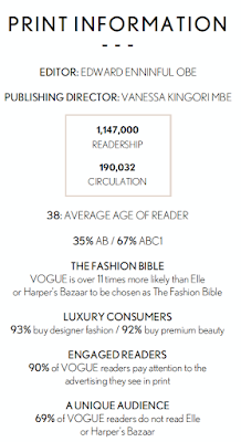
The feature magazine for Vogue, a fashion and lifestyle magazine, has used an image of the actress Emma Stone, who the article is about, in order to promote their article. Vogue is over 11 times more likely than Elle or Harper's Bazaar to be chosen as the 'Fashion Bible'. The image introduces her to the readers of the magazine as they are able to refer back at the image of whom the article is talking about so they know what she looks like and who she is when reading about her. This means that the reader would be judging what she is wearing and what she looks like back to the magazine where the image originated from and since they are seen as the 'Fashion Bible' they have to make Emma Stone look her best in order to draw readers in even more.The image also grabs the reader's attention and would be the first thing they look at before actually reading the article meaning that it needs to stand out in order to keep readers enticed in the article. One notable eye-catching feature in the image is the colour contrast between Emma Stone's make up, clothing and the background which all relate to certain aspects of what the magazine mainly focuses on in order to attract its readers. The colour blue signifies loyalty and wisdom which relates to the target audience of the magazine being well educated and buying each edition of the magazine as it comes out which creates a bond between the reader and magazine. Finally, because Emma Stone looks so glamorous in this image, it promotes the article because the reader would want to read on to find out more about her life etc.

2)How has the magazine used their layout to make their articles enticing?
Vogue has used their layout in a formal detailed way in order to make the article more enticing. The small font is presented in columns, like a traditional newspaper's layout, which relates to the formality of the magazine. The article uses a font called Serif which makes the article and what its trying to sell to its readers more luxurious and expensive. In the middle of the two columns on the right is a text box with an enlarged line from the article inside it in order to make it stand out which shows its importance. In the top left hand corner is a huge letter 'W' in comparison to the normal text size. This catches the readers eye as they know where to start reading and breaks up the text a bit in order to make it more manageable to read. The fact that the image is so big compared to the text suggests how the image is more important for the reader to see. This is because this draws in the reader to the article as it makes it more enticing and better than just having text to read.

3)How has the magazine article used text to engage their readers?
-Write down any effective sentences or quotes that are particularly engaging and explain how they appeal to their target audience.
Vogue's article has used a quotation in a bigger, bolder text in order to catch the reader's eye because it is more important and engaging than the smaller font (which is the main text). It reads, "Stone is the quirky, cool girl from school: the one you'd sit, next to, hoping you'd becoming cooler via osmosis". The fact that the quotation uses the word "you'd" makes it relatable to the target audience of young, well-educated women, and engages them because they feel as if they would grew up with Emma Stone who is now an extremely successful actress as she is portrayed from the quotation as being down to Earth and easy to get on with, even with her huge fame.