Social Grade (determines which members of society are reading/watching media)
Task: Read the following articles and the information on both and then answer the following questions


1)How has the feature magazine used images to promote their article?
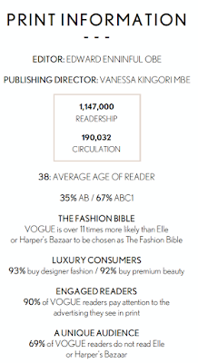
The feature magazine for Vogue, a fashion and lifestyle magazine, has used an image of the actress Emma Stone, who the article is about, in order to promote their article. Vogue is over 11 times more likely than Elle or Harper's Bazaar to be chosen as the 'Fashion Bible'. The image introduces her to the readers of the magazine as they are able to refer back at the image of whom the article is talking about so they know what she looks like and who she is when reading about her. This means that the reader would be judging what she is wearing and what she looks like back to the magazine where the image originated from and since they are seen as the 'Fashion Bible' they have to make Emma Stone look her best in order to draw readers in even more.The image also grabs the reader's attention and would be the first thing they look at before actually reading the article meaning that it needs to stand out in order to keep readers enticed in the article. One notable eye-catching feature in the image is the colour contrast between Emma Stone's make up, clothing and the background which all relate to certain aspects of what the magazine mainly focuses on in order to attract its readers. The colour blue signifies loyalty and wisdom which relates to the target audience of the magazine being well educated and buying each edition of the magazine as it comes out which creates a bond between the reader and magazine. Finally, because Emma Stone looks so glamorous in this image, it promotes the article because the reader would want to read on to find out more about her life etc.
2)How has the magazine used their layout to make their articles enticing?
Vogue has used their layout in a formal detailed way in order to make the article more enticing. The small font is presented in columns, like a traditional newspaper's layout, which relates to the formality of the magazine. The article uses a font called Serif which makes the article and what its trying to sell to its readers more luxurious and expensive. In the middle of the two columns on the right is a text box with an enlarged line from the article inside it in order to make it stand out which shows its importance. In the top left hand corner is a huge letter 'W' in comparison to the normal text size. This catches the readers eye as they know where to start reading and breaks up the text a bit in order to make it more manageable to read. The fact that the image is so big compared to the text suggests how the image is more important for the reader to see. This is because this draws in the reader to the article as it makes it more enticing and better than just having text to read.
3)How has the magazine article used text to engage their readers?
-Write down any effective sentences or quotes that are particularly engaging and explain how they appeal to their target audience.
Vogue's article has used a quotation in a bigger, bolder text in order to catch the reader's eye because it is more important and engaging than the smaller font (which is the main text). It reads, "Stone is the quirky, cool girl from school: the one you'd sit, next to, hoping you'd becoming cooler via osmosis". The fact that the quotation uses the word "you'd" makes it relatable to the target audience of young, well-educated women, and engages them because they feel as if they would grew up with Emma Stone who is now an extremely successful actress as she is portrayed from the quotation as being down to Earth and easy to get on with, even with her huge fame.

No comments:
Post a Comment